Introduction
Being a bachelor student from The University of Turku, doing a thesis is part of my studies. My name is Ohto, I am a student from The University of Turku. My interests have always been working on the Tanzania project in order to contribute to the communities in Tanzania. This is why I decided to use my thesis to work on the Flood risk mapping in Dar es Salaam.
The review from different literatures shows that Dar es Salaam is the fastest growing city in Tanzania and Africa which leads to poor infrastructure especially during rainy season. It also shows that every rainy season there is flooding. The effect to that is that people lost their properties and some lost their lives.
As a way to contribute from my thesis, I decided to select the area in Dar es Salaam that has experienced flood mostly all the time during the rainy season which in this case I selected Tandale ward. My contribution is to use the available data to visualize the flooding issue in order to help the community who live in that community. I believe that good visualization will help the community to understand the areas that re-flooded to therefore take precautions. Therefore, I decided to work on the data which has been collected into the Climate Risk Database (CRD) by Resilience Academy in order to create different visualization.
The Data
In this study, Tandale is used as an example ward, but similar maps can be made of all wards in Dar es Salaam using the open data in the CRD from Resilience Academy initiatives. I found the data after talking to teachers in the department of geography at the University of Turku. I had also heard about the Resilience Academy and the CRD data during my studies.
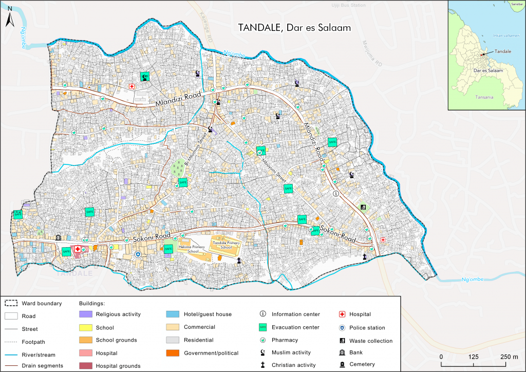
The maps and analyses were made using the ArcGIS Pro 2.5 software. Everything can be done using QGIS as well. All the data used in this project was acquired from the Resilience Academy’s Climate Risk Database, except for the rivers and streams, which I digitized myself using satellite imagery and OpenStreetMap. Some of the bigger roads were also digitized into polygons. The area outside of Tandale’s boundaries was visualized using an ArcGIS Pro basemap. I wanted to create a general map of the ward first, which I could then use as a basemap for the analysis and visualization on later maps. I used the Ramani Huria Atlas of Flood Resilience in Dar es Salaam maps as a starting point and as examples of mapping.
visualization techniques
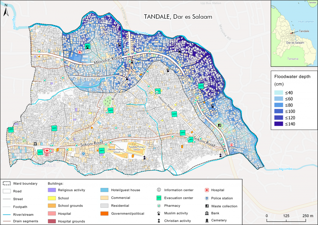
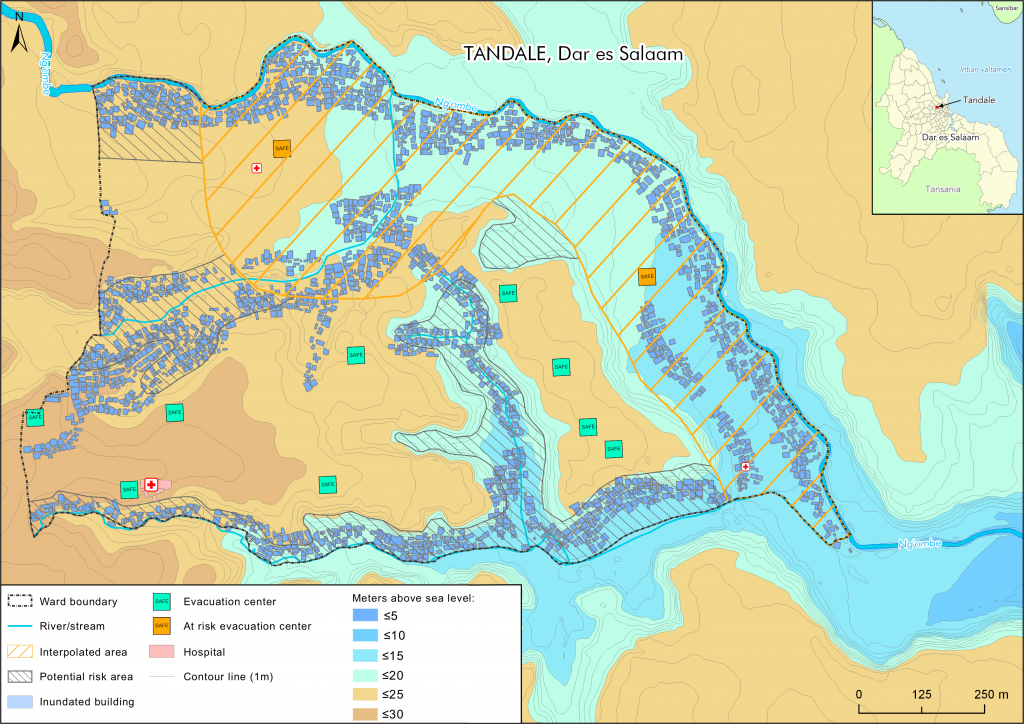
I started by cleaned the data as there were some discrepancies in the metadata. Then I merged the building polygon data (Dar es Salaam Buildings) with the different building point datasets (for example Dar es Salaam Schools’ Locations) to get a more detailed polygon dataset for the base map as some buildings were marked as “residential” in the polygon data and for example as “retail services” in the point data. For the interpolation to be possible I changed the flood height data in the “Dar es Salaam Flood Extents” attribute table from text format into numerical values. I only used the historical maximum flood depth values from the estimates to get a visualization of the worst possible flood according to the historical data collected in the CRD.
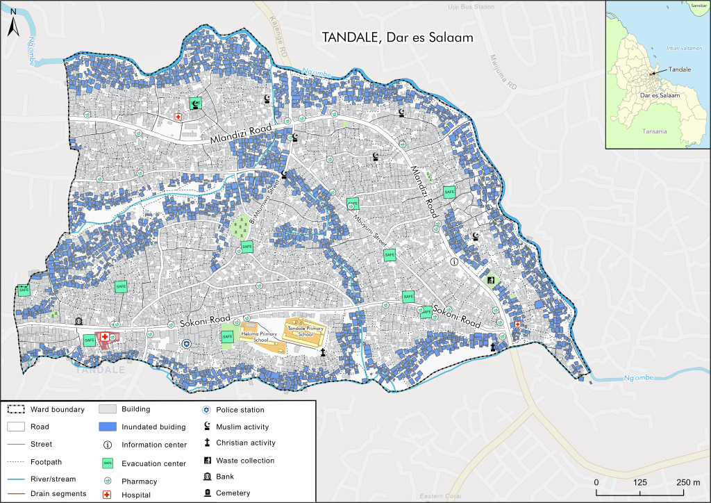
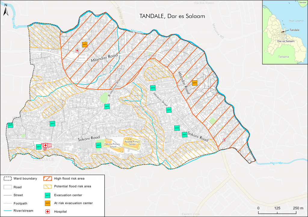
I combined all the data into one final map which visualizes all of the areas susceptible to flooding. As I mentioned in the introduction, the objective of this visualization was to show the community who live in Tandale and everyone interested where the high-risk areas are in terms of flooding without much need for interpretation. In this visualization, I took color blindness into account while choosing colors for visualization as it affects a substantial proportion of the worldwide human population. I also tried to make them as universally understandable as possible.
Acknowledgments
This bachelors’ thesis would not have been possible without the data provided by the Resilience Academy. The amount of open-access data is substantial, and the data is highly detailed. I found working with the data very easy and enjoyable. It is an amazing resource to have for GIS projects in the area and has a lot of potential for all kinds of urban planning projects and not only flood mapping. I appreciate the fact that a lot of the data was collected by listening to local residents. This is a way for them to have their voices heard and concerns visualized. This way local residents most likely do not feel left out and feel like a part of the project. This can be very empowering.
Recommendations
This type of maps could be used in raising awareness of the extent of flooding, to highlight risk areas to locals and government officials and to teach young children about flood risk areas. I hope these maps may provide someone else with ideas on how to visualize flood threats in Dar es Salaam or in other urban planning projects. I would like to thank Msilikale Msilanga, Niina Käyhkö, Sanna Mäki and my classmates for their help and guidance.
Post written by Ohto Nygren and Msilikale Msilanga